Comparisons can be considered the cornerstone of science, though accurate ones can be notoriously difficult to achieve. In research design, comparisons appear in the context of control groups. When a medication is described as safe and effective, the only way to establish that is through comparisons, including to placebo; a pill that seems to alleviate pain may in fact subjectively do so but is only considered effective if it alleviates pain better than an identical pill without an active ingredient.
Outside the rigors of science, comparisons are common in everyday life and on social media. Sometimes they’re accurate, but often they’re deeply flawed and presented in service of some specific advertising, political, or social agenda (for more, see my article “Skepticism and Pseudoexperiments” in the September/October 2020 issue of SI). Flawed comparisons and analogies can be difficult to spot, and I have a particular interest in visual misrepresentations, specifically charts, graphs, and maps that are presented as self-evidently authoritative but are inaccurate or, more insidiously, technically accurate but misleading. In his classic book Envisioning Information, Yale professor and information representation pioneer Edward R. Tufte (1990, 67) wrote, “At the heart of quantitative reasoning is a single question: Compared to what?”
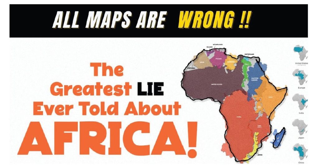
Several ostensibly skeptical friends and colleagues shared a map on social media describing “The True Size of Africa” (Figure 1). Created by a software engineer named Kai Krause, it had been circulating for years and shared by many, including comedian Stephen Fry, but—like most people—I hadn’t taken a closer look at it. Having traveled extensively in Africa, I was (perhaps unusually for an American) aware of how large the continent is, but the comparisons Krause’s map offers didn’t seem accurate.
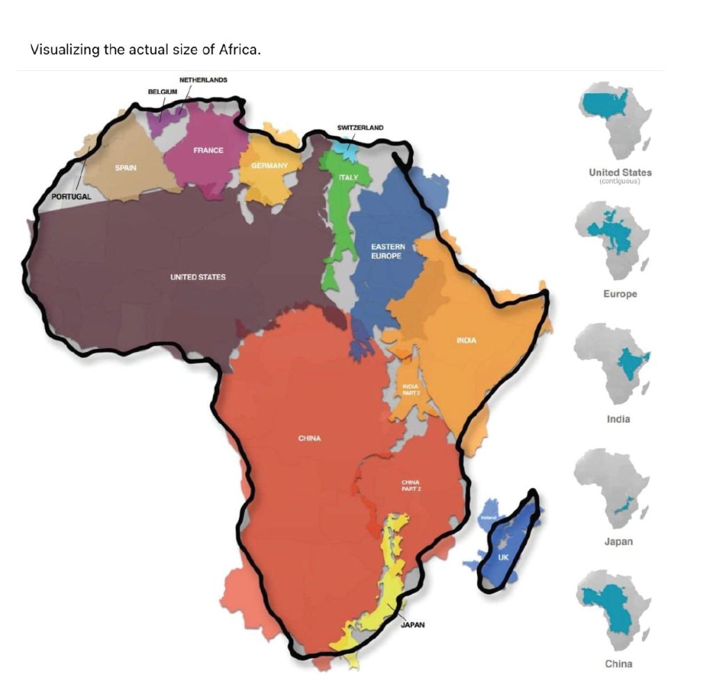
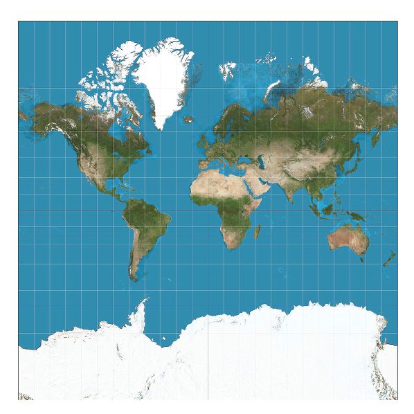
There were a few red flags that this seemingly authoritative and informational infographic is less than accurate. Most obviously, it compares the size of Africa not to another continent but to other countries. If the point of Krause’s map is to compare landmass sizes, he could just compare apples to apples, continents to continents. The same point could be made by comparing North America to Africa. There’s no need to resort to a flawed categorical comparison. Second, even by its own standards, the Krause map is deceptive. It conveniently excludes Alaska—by far the largest state at nearly three times the size of Texas—from its depiction of how the United States fits into an outline of Africa. When I pointed out some of these errors, I was offered additional resources that, I was assured, would verify and clarify its intent (if not its particulars). The Krause map was created largely in response to the much more prominent (and controversial) Mercator projection map (see Figure 2 on p. 54), said to intentionally distort the size of Africa (and also Europe, by comparison); more on this later.
Mapping Kai Krause
Kenneth Field, principal lecturer in geographic information systems at Kingston University in London, examined Krause’s map in an editorial for The Cartographic Journal, published by the British Cartographic Society. He wrote:
On closer inspection there are some aspects of this info-graphic that undermine its attempt to portray the relationship between the land areas of various countries. The Republic of Ireland is included in the UK map; an odd collection of countries are labelled Eastern Europe; China and India are bizarrely carved up for artistic purposes (to make them fit); and Alaska is omitted altogether which reduces the land area of the USA considerably … I’ve left the most fundamental error to last though … the map shapes Krause uses are not Equal Area. They are, in fact Web (or spherical) Mercator. (Field 2010)
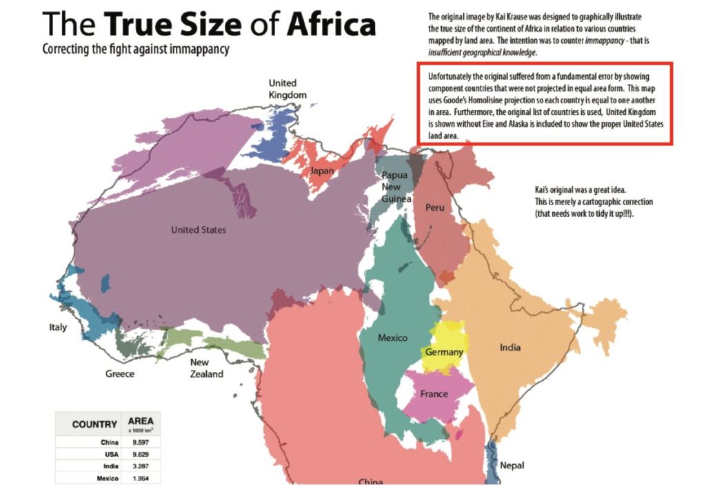
Ultimately, Field wrote, “I don’t take issue with the idea of exposing the problem of spatial illiteracy, or immappancy as Krause has defined it, but he is profoundly guilty of similar levels of immappancy by creating a completely inaccurate depiction. He is demonstrating his own immappancy” (Field 2010). Field created his own map to more accurately illustrate the point Krause was trying to make (see Figure 3 on p. 55 for detail).
Despite the viral and vociferous nature of Krause’s map, it is in fact wrong in significant ways. But I got the impression many elided the errors and deceptions because it was issued in service of a noble cause: social justice. The Krause map, however factually flawed, helps decolonize education and mitigate Eurocentric structural racism.
Decolonizing Mercator
A cluster of claims emerged about Mercator’s map: first that it was designed to denigrate non-Europeans (specifically Africans); second that it did so by convincing the public that Africa is smaller than it actually is (and/or as compared to Europe); and third that this map has had a demonstrable harmful effect.
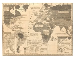
We can begin by acknowledging that European expansion and colonialism was historically driven at least in part by racism as much as financial gain. Exploitation of developing countries has a long and shameful past that continues to this day—especially in Africa (see, for example, King Leopold’s Ghost: A Story of Greed, Terror and Heroism in Colonial Africa). There are many examples of map bias introduced in primary schools. For example, the Library of Congress highlighted a map created in 1821 by William Channing Woodbridge (1794–1854), an evangelical Christian and educator of young women and the deaf. The map, titled A Moral and Political Chart of the Inhabited World, taught American students about the rest of the world, categorizing non-Westerners according to cultural hierarchies (Figure 4 on p. 56). While greatly enlarging the size of Europe (and dedicating an inset to the continent), it also depicts much of America as populated by “savages”—surrounded by a smattering of (presumably better) “barbarians.” “Woodbridge produced his chart to both instruct school children and inform a general adult audience. The Moral and Political Chart of the World appeared in several states within multiple editions of both his School Atlas and his Modern Atlas between 1821 and 1843” (Klein 2021). There are many other biased (and subtler) maps that have been used for racist and imperialist purposes, but the question at hand is what role Mercator’s map, specifically, played.1
Forbes Leadership columnist Chuck Swoboda, in a piece titled “What This 3-Minute Scene From ‘The West Wing’ About Maps Can Teach You About Leadership,” wrote of the Mercator map:
To our detriment, we’re still accepting it as fact today. This conundrum first came to my attention in 2001 while watching an episode of NBC’s TV political drama The West Wing. In one memorable three-minute scene, White House Press Secretary C.J. Gregg (Allison Janney) grants an audience to a group of socially minded cartographers on a noble mission: to convince the President to officially adopt a new global map that is more respectful of Third World countries. The group explains why conventional world maps are wrong and, worse, how this leads to misguided social perspectives that extend far beyond geography. For example, on a Mercator projection map, Greenland and Africa appear to be roughly the same size. But the problem, explains one of the cartographers, is that, in reality, Africa is fourteen times larger than Greenland. (Swoboda 2020)
Though the socially conscious cartographic association in The West Wing is fictional, it has real-world counterparts. As CNN reported,
The Mercator map can make enlarged countries seem unnaturally powerful and intimidating … Marianne Franklin, professor of Global Media and Politics at Goldsmiths, University of London [stated] “The world maps that prevail today have been embedded in Western imaginations … despite many challenges to their fairness and accuracy because they underpin the ongoing Anglo-Euro-American presumption that the world belongs to them.” (Morlin-Yron 2017)
Some criticisms echoed of quasi-conspiracy theory zealotry. For them, it was not merely misleading; it is—and indeed “all maps” are—“The Greatest LIE Ever Told About Africa!”(see Figure 5 on p. 56).
Many made assumptions about Mercator’s imperialistic intent. For example, The Guardian states that Mercator “placed western Europe in the middle of his map” (Walters 2017)—though Africa is in fact squarely in the middle—and Awoowe Hamza of The Huffington Post asked why “Western countries [are] shown as bigger in size … why have they been distorted? Is it to reflect their self-importance, or perhaps convince you that your country is smaller than it actually is? Or is it just a subconscious reminder to ensure you never forget who is really in charge?” (Hamza 2014). One school director stated that the Mercator map “is, in my mind, one of the most insidious examples of how schools perpetuate racism” (Johnson 2017). Based on this concern, a movement was launched to replace the Mercator map with one by Arno Peters (more on this later) in Boston, Massachusetts, classrooms.
Mercator’s Milieu
Mercator devised his most famous projection in 1569, and it became popular and widely used—not because it diminished the size of Africa but instead because it was a long-sought breakthrough navigational aid. It represented lines of constant course as straight segments and the meridians equally spaced. In other words, sailors merely needed to follow a true bearing or straight-line course to get from port to port. The path wasn’t always the shortest, but it was the safest and most direct. A side effect was that the projection grossly distorts geographical regions toward each of the poles. All maps distort shapes or sizes, some more so than others. It didn’t intentionally inflate the size of Europe or the Americas (or Asia for that matter); that’s a function of the landmass distortion increasing near the poles and most of Earth’s landmass being north of the equator. When viewed through this lens of functionality, this distortion was not a cynical conspiracy to fool generations of geographically challenged students (or racist European colonialists) into thinking that Africa is smaller than it is.
The fact that representing a three-dimensional object on a two-dimensional surface inherently creates distortions was recognized as far back as Ptolemy. Maps are designed and used for specific purposes, and in the 1500s, a cartographer’s greatest concern was getting people (and goods) across oceans. Navigators were not concerned about whether one continent took up a few extra square inches on their charts or if the sizes of the continents were accurately represented. Their concerns were much more practical: sailing between distant ports as quickly and safely as possible. The oceans were dangerous places to be, between sudden squalls, doldrums, pirates, hurricanes, tidal waves, running out of fresh water, and so on. Being off by even a few degrees could make the difference between life and death for the captains and their crews.
A millennia before Mercator, Ptolemy also exaggerated the size of Europe, believing that when combined with Asia the two covered half of the globe’s circumference. This was due not to latent Eurocentrism or colonialist aspirations but instead underestimating the size of Earth. (In fact, Christopher Columbus mistakenly believed that he’d reached East Asia centuries later based in part on Ptolemy’s error.)
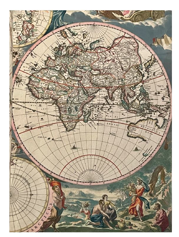
Even a cursory glance at the Mercator projection reveals that Africa appears much larger than Europe—and certainly than Great Britain and Flanders. A map published in 1672 by Hendrick Doncker, also from the Netherlands, titled A New Map of the Whole World by Frederick de Wit shows Africa as far larger than Europe as well (see Figure 6).2 If Mercator’s goal in designing the map had been to exalt his homeland at the expense of Africa, he seems to have done a rather poor job of it. Because geographical distortion increases toward the poles, the regions “benefitting” from the exaggeration are modern-day Greenland, Canada, Russia, and the Nordic countries—not Mercator’s homeland of Eastern Europe. Furthermore, Mercator’s projection depicts South America and Africa—both targets of European colonization—as about the same size when in fact Africa is half again as large. Thus, while the map minimized Africa’s size compared to Europe, it also did so compared to South America, with no clear motivation or rationale. Mercator could have easily created a map that privileged the Flemish region, but that wasn’t his purpose.
During Mercator’s time, it was not Europeans collectively seeking to dominate the rest of the world; it was instead Europeans fighting each other—a pattern that would last through centuries of colonization. British, Dutch, French, Spanish, and Portuguese ships would routinely attack each other on the open seas (and later encourage privateers—de facto pirates—to do so with impunity via letters of marque). It’s certainly true that some European countries were colonizers, but they were not united and didn’t think of themselves as Europeans. The year Mercator published the project in Cosmographia, for example, the Dutch War of Independence raged between the Netherlands and the Spanish government and would last over eighty years. The Dutch were soon attacking Portuguese settlements throughout much of the first half of the sixteenth century. The English were also fighting the Portuguese, German Catholics were attacking Protestants in modern-day Czech Republic, the Spanish invaded England in 1588, Lisbon was in the throes of a fever epidemic that killed 40,000 people, the Turks and Venice were at war, and so on. In short, there was little in the way of unity or “European” pride at the time and little incentive for Mercator to diminish the size of Africa to bolster the (nonexistent) collective European ego or fuel colonialism.
More fundamentally, Mercator and other cartographers would have little purpose in minimizing Africa on a map. Africa, like the Americas and Asia, was not viewed by Europeans as small, unimportant locations that were beneath them or unworthy of consideration. Quite the opposite: They were lands of vast resources (lumber, minerals, slaves, spices, etc.) to be exploited.
This argument is also undermined by the principle of Occam’s razor (and Hanlon’s razor as well). The simplest explanation for Mercator’s projection—and the one universally endorsed by historians—is that the goal was to improve navigation, not provide an ego boost to Europeans who wanted their countries to look bigger on a map. We should also avoid the post hoc ergo propter hoc logical fallacy. It’s certainly possible that those who came later (among them educators and racists) adopted Mercator’s projection for their own ends, but that’s a separate issue; Woodbridge’s map, described earlier and reflecting the doctrine of Manifest Destiny, appeared some 250 years after Mercator.
Do People Underestimate Africa’s Size?
Though it seems that it wasn’t Mercator’s intent to create a map that spawned or perpetuated European colonialism, it might have had that unintended effect. On this matter, once again, the claims are bold, but the evidence is faint.
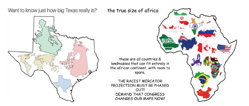
Part of the controversy is the assumption that (many? most?) people don’t realize how big a continent Africa is. Invoking Hyman’s skeptical dictum to be sure something is true before trying to find out why it’s true, I was unable to find any data or research showing that the public consistently underestimates the size of Africa (or any other continent)—or, by corollary, overestimate the size of Europe or North America (or any other continent). It’s certainly plausible given the poor grasp of geography that plagues educational systems but seems to be one of those “everyone knows” factoids that few people bother to verify. One can acknowledge the poor state of American education—and geographical knowledge specifically—without exaggerating the problem. The controversy inspired amusing memes mocking the premise, such as showing just how big the famously large state of Texas is (see Figure 7 on p. 58).
But for the sake of argument, we can concede that it’s possible—perhaps even likely—that the average person’s ideas about the sizes of the continents is skewed. Why would that matter? After all, there are a great many errors in comparisons that one could make about the world, from which countries have the most lakes to which continents have the highest mountains, the largest deposits of aluminum ore, or the largest number of Muslims. These geographical and demographic details seem neither salient nor relevant to most people’s lives or worldviews; even if terribly wrong, these mistakes would seem picayune. If people underestimate their chance of catching COVID-19 or being in a car accident, acting on that misperception can cause real-world harm if it leads to refusal to be vaccinated or buckle up. But if people underestimate the size of Africa or any other continent, it’s not clear what the practical consequences might be (beyond losing a trivia question perhaps).
Equating Size and Importance?
The answer lies in the assumption that, as stated on The West Wing, “In our society we unconsciously equate size with importance and even power.” The 2020 Forbes article by Swoboda echoes this assertion: “the size of countries implies to many people the relative importance of that country—bigger is better.”
But is that true?
Do most people assume that larger areas are inherently superior to smaller ones? Do people unconsciously assume that Washington, D.C.—at just under seventy square miles—is less important and powerful than California, Pennsylvania, or Florida merely because of its geographical size? Or that Algeria and Argentina (at 919,600 and 1.07 million square miles, respectively) are obviously and intuitively far more important than Italy or Ireland (at 116,310 and 32,595 square miles, respectively)? At one point, it was said that the Sun never set on the British Empire—based in the United Kingdom, which is far smaller than (presumably more important and powerful) countries such as Burkina Faso, Uzbekistan, Botswana, and Chad. It’s true that most of the top ten largest countries by landmass are economically and politically powerful (Russia, Canada, China, the United States, Brazil, and Australia among them), but it’s not clear that status is attributable to raw acreage. In fact, most of these countries have wide swaths of land that are sparsely populated.
As Field noted about Krause’s “True Size of Africa” map:
Approximately 45% of Africa is comprised of the uninhabitable Sahara Desert which also renders the comparison a little misleading and certainly points to a further issue: that land area isn’t the best metric for comparison anyway because we might be more concerned as a society with what constitutes habitable areas. Africa is certainly bigger than the combination of the countries Krause uses but it is a continent of over 50 countries and has a smaller overall population than either India or China. (Field 2010)
It’s not clear why anyone would assume that geographical sizes are a valid metric of their relative socio-economic, historical, and cultural importance. In fact, the Peters projection could arguably be miseducating children by implicitly suggesting that land area in a given country or continent is somehow correlated with power or prestige. Of all the metrics of power and importance—population, GDP, resources, nuclear capability (industrial and military), treaty membership, and so on—geographical size must surely be among the least important, intuitive, and valid. Israel, for example, is enormously powerful and influential despite being just over 8,500 square miles. (One could argue that the Holy See, which has as its capital Vatican City, is the most powerful and important “country” in the world despite being the smallest at a mere 109 acres of land.)3
Mapping Arno Peters
Regardless of whether or not people under- or overestimate the sizes of continents or what the social justice implications of that might be, the question remains whether the Peters (also known as the Gall-Peters) map, introduced in Boston schools in 2017, is any more accurate, egalitarian, or “fair.”
In his classic book How to Lie With Maps, Mark Monmonier, Distinguished Professor of Geography at Syracuse University and an editor of the History of Cartography series, devoted a few pages to this issue, and he was not impressed with Mercator’s critics. In fact, just as Field accused Krause of immapancy, Monmonier accused Peters of deception and sloppy work. Monmonier offered a brief history of the efforts to “fix” Mercator’s “misleading” maps and is worth quoting at length:
In the early 1970s this subtle and probably unwitting geopolitical propaganda served as a convenient straw man for German historian Arno Peters, who published a “new” world map based on an equal-area projection similar to the one described in 1855 by the Reverend James Gall, a Scottish clergyman … the Gall-Peters projection gives tropical continents a mildly attenuated, stretched look, which probably explains why geographers and cartographers have adopted more plausible equal-area maps … But Dr. Peters knew how to work the crowd. A journalist-historian with a doctoral dissertation on political propaganda, Peters held a press conference to condemn the Mercator worldview and to tout his own projection’s “fidelity of area” and more accurate, “more egalitarian” representation of the globe. By calling attention to the Mercator’s slighted portrayal of most developing nations and blaming a stagnation in the development of cartography, Peters struck responsive chords. (Monmonier 2018, 111)
Monmonier notes that the much-hyped Peters map in fact contributed to the very problem it’s claimed to solve—again, much as Krause’s well-intended remedy for immapancy merely perpetuated it:
Ironically, by succumbing to Peters’s hype, UNESCO and other organizations sensitive to problems of the developing world loyally backed the wrong projection and missed an enormous propaganda opportunity. By accepting uncritically the rather dubious assumption that a map responsive to people should accurately represent land area, these groups not only demonstrated a profound cartographic naivete but also ignored a more humanistic type of map projection that actually makes some developing-world populations appear justifiably enormous, rather than gaunt and emaciated. How much more convincing their media blitz might have been had they supported a demographic based map, or area cartogram, on which the area of each country is scaled according to the number of inhabitants. (Monmonier 2018, 112)
The irony is that there was indeed social propaganda surrounding the Mercator projection; it wasn’t by Mercator but instead Arno Peters and those he influenced, including the writers of the West Wing. Mercator’s projection distorts sizes at the expense of shapes, while Peters’s projection distorts shapes at the expense of sizes. Neither is accurate nor inaccurate; one is not inherently better than another. As with all maps, it depends on the use. The issue of whether it’s more important that students be aware of the sizes of the continents or the shapes is a fair question—and one best answered by geography teachers. One solution is to use a map that better compromises the two distortions, such as the Winkel Tripel map, widely used by the National Geographic Society.
Misinformation and Miseducation
Returning to the immapancy demonstrated by Krause’s “True Size of Africa” map, Field echoes a perennial skeptical complaint, lamenting the ease and speed with which the misinformation spread:
Herein lies the problem—Krause’s map would have been missed and ignored by virtually everyone had [Stephen] Fry not made mention of it. By ignorantly passing on such a misinformed piece of work the problem of immappancy is simply propagated further and Fry’s global popularity and audience means the potential for further misinterpretation is immeasurable. How many of Fry’s followers know, or care, of the difference between countries projected using Web Mercator and those projected using Goode’s Homolosine? They shouldn’t have to worry about such matters if the original had been constructed with any sense of cartographic accuracy. (Field 2010)
Much in the same way that it’s difficult to get cranks and conspiracy promoters to acknowledge that experts in the field might just know more about the topic than they do—despite the hours spent “researching” on YouTube—Field notes that “It seems to be an insurmountable challenge to persuade the general public and those that play with map imagery that there are people who actually know about maps and that there is actually quite a lot about maps to know if one is to successfully create and use them” (Field 2010, 293).
Krause eventually acknowledged that his map was indeed flawed in several ways—including, ironically, size comparisons between countries: “Had I stretched things to truly properly show [accurate size comparisons] though, then the whole shape of Africa would have looked very awkwardly elongated. I chose to tell the basic puzzle piece fitting story by using the familiar shapes.” He revised the map slightly while accusing his critics of “missing the point” and that his map “was not at all an attempt to create ‘an accurate map’, it was merely a simple graphical depiction of the statement: Africa is just immense” (emphasis in original; Krause n.d.). This smacks of defensive goalpost moving, especially given the explicitly stated context of trying to correct rampant immapancy with accurate information (not to mention the bold, veracity-averring title “True Size of Africa”). Krause needn’t have gone to the trouble of listing country areas and fitting them into an outline to just remind people that Africa is big.
Monmonier similarly decried the rush to embrace the flawed Peters projection:
Religious and international development organizations welcomed Peters and his “new cartography,” with the greater fairness and accuracy it promised … Perhaps because journalists also like to champion the oppressed and can’t resist a good fight, the press repeated Peters’s claims and reported the success of his bandwagon. Academic cartographers became both puzzled and enraged—puzzled that the media and such prominent, respected institutions could be so gullible and ignorant, and enraged that these groups not only so persistently repeated Peters’s preposterous assertions but so obstinately refused to look at cartography’s writings, accomplishments, and rich history. (Monmonier 2018, 111)
Critics of the Mercator projection have offered little or no evidence that Americans (or anyone else) have been misled or deceived by Big Geography into thinking that Africa is a small continent or that the Mercator projection specifically is to blame even if that was the case. This quasi-conspiracy has populist appeal, especially among liberals, but has scant evidence to support it. Unfortunately, two well-intended efforts to remedy the issue have both spread misinformation and contributed to the confusion. In education as in medicine: Primum non nocere.
Notes
1. Of course, it’s not as if students weren’t exposed to accurate continent sizes regardless of the prominence of Mercator’s map. Globes, which do not distort the sizes of continents, have been standard fixtures in classrooms at American schools since the late 1800s (Mercator created several globes, including one in 1541).
2. Not only does Africa appear far larger than Europe, the map also shows Antarctica as far larger than Africa and Europe combined. If the size of a given landmass was intended to have (or resulted in) viewers psychologically or culturally correlating it with corresponding importance, it’s a wonder that Europeans didn’t rush to the South Pole.
3. My home state of New Mexico, for example, is the fourth largest state in America; it’s also one of the poorest and most sparsely populated. Its size doesn’t seem to convey any particular importance to many people, either inside or outside the United States. (In fact, many people don’t even know it’s a state; locals swap stories of being asked whether a passport is needed to visit.)
References
Field, Kenneth. 2010. Disconnected cartographies and immappancy. The Cartographic Journal 47(4): 291–296. Online at https://www.tandfonline.com/doi/abs/10.1179/000870410X12880881156093.
Hamza, Awoowe. 2014. The third world fallacy: What it really means to be from a third world country. Huffington Post (March 13). Online at https://www.huffingtonpost.co.uk/awoowe-hamza/third-world-countries_b_4954802.html.
Johnson, Akilah. 2017. Boston schools ditch conventional world maps in favor of this one. Boston Globe (March 16). Online at https://www.bostonglobe.com/metro/2017/03/16/north-america-really-bigger-than-africa-this-map-sets-things-straight/lK52K7aKYFpQ3b8ujJj6LP/story.html.
Klein, Mike. 2021. When “savages” roamed the earth: Maps perpetuating bias and bigotry in the 19th century. Library of Congress Blogs (April 7). Online at https://blogs.loc.gov/maps/2021/04/when-savages-roamed-the-earth-maps-perpetuating-bias-and-bigotry-in-the-19th-century/.
Krause, Kai. N.d. The true size of Africa. Online at http://kai.sub.blue/en/africa.html.
Monmonier, Mark. 2018. How to Lie with Maps, 3rd edition. Chicago, IL: The University of Chicago Press.
Morlin-Yron, Sophie. 2017. What’s the real size of Africa? How Western states used maps to downplay size of continent. CNN (March 23). Online at https://www.cnn.com/2016/08/18/africa/real-size-of-africa/index.html.
Swoboda, Chuck. 2020. What this 3-minute scene from ‘The West Wing’ about maps can teach you about leadership. Forbes (July 14). Online at https://www.forbes.com/sites/chuckswoboda/2020/07/14/what-this-3-minute-scene-from-the-west-wing-about-maps-can-teach-you-about-leadership/?sh=774d24781896.
Tufte, Edward R. 1990. Envisioning Information. Cheshire, CT: Graphics Press.
Walters, Joanna. 2017. Boston public schools map switch aims to amend 500 years of distortion. The Guardian (March 23). Online at https://www.theguardian.com/education/2017/mar/19/boston-public-schools-world-map-mercator-peters-projection.